08
Oct
2018
by Eve, in (No Comments)

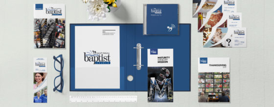
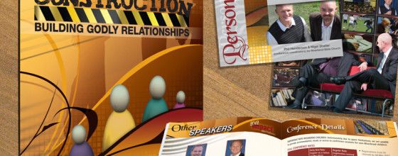
The design of a logo is the hard part of a branding project, so once that was done, its rollout into various print collateral pieces flows out pretty organically. The brand ‘flavour’ of Hastings Baptist Church material needed to be ‘clear and simple’. So although I could make dramatic...
08
Oct
2018
by Eve, in (No Comments)

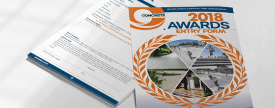
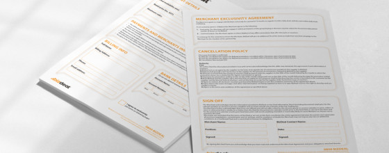
The New Zealand Concrete Contractors Association run an annual award ceremony to recognise the achievements of various contractors in concreting industries. The NZCCA membership is spread across the country, so they needed a form that could be distributed over this distance with speed and efficiency. So this form was...
08
Oct
2018
by Eve, in (No Comments)

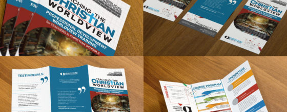
The client needed a tri-fold brochure to promote a course designed for the faculty of Christian schools. They emphasised the importance of reader interest and engagement, so I kept the background clear and unobtrusive, and instead used bold colours only for the elements they wanted the reader to notice....
08
Oct
2018
by Eve, in (No Comments)

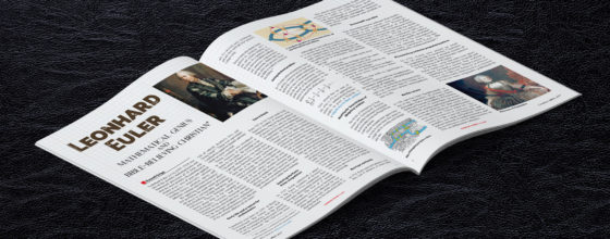
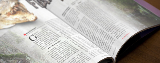
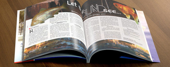
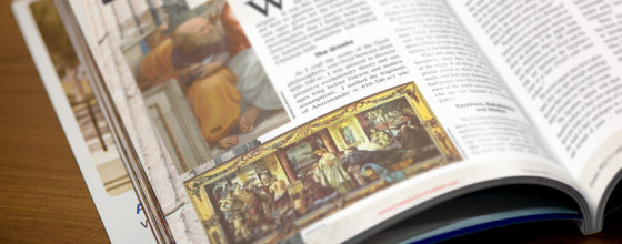
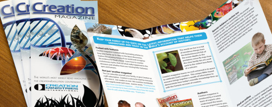
Creation is a 56pg full-colour family magazine, published quarterly by CMI, with subscribers in over 170 countries, and a print run of 60,000. Individual articles are delegated amongst a team of the client’s own layout designers, and I assist with overflow if required. My task for the article shown...
08
Oct
2018
by Eve, in (No Comments)

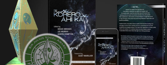
This cover work was a finalist in the 2019 Sir Julius Vogel awards, in the category of Best Professional Artwork. Te Kōrero Ahi Kā is an anthology by members of SpecFicNZ —an association of speculative fiction writers in New Zealand. (Speculative fiction is a genre that encompasses all work...
08
Oct
2018
by Eve, in (No Comments)

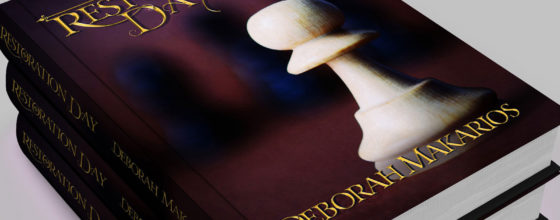
My novelist client wanted title typography that she could place over a pre-selected cover image, and she wanted it of the ornamental style that readers of fantasy associate with novels of that genre; golden and eye-catching, but not so embellished that it became hard to read. My design used...
18
Jun
2015
by Eve, in (No Comments)

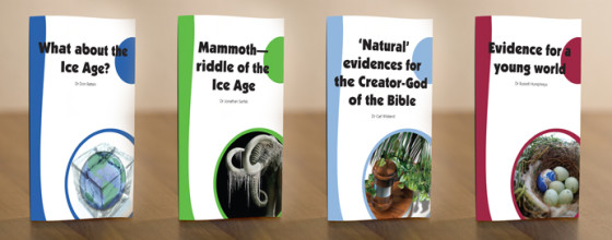
From a booklet series of 18. I particularly enjoyed doing these four, because instead of using a simple photograph for the image—such things aren’t always easy to come by, depending on topic—I made photo-manipulative composites. (It was easier than actually finding an iced-over wooly mammoth and taking a picture of it.)
