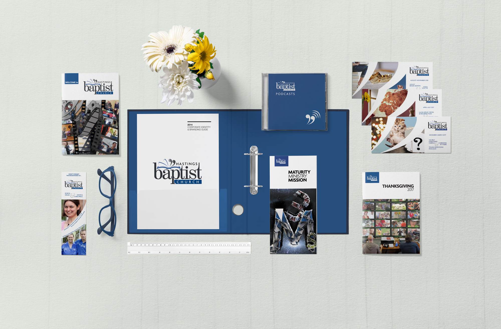
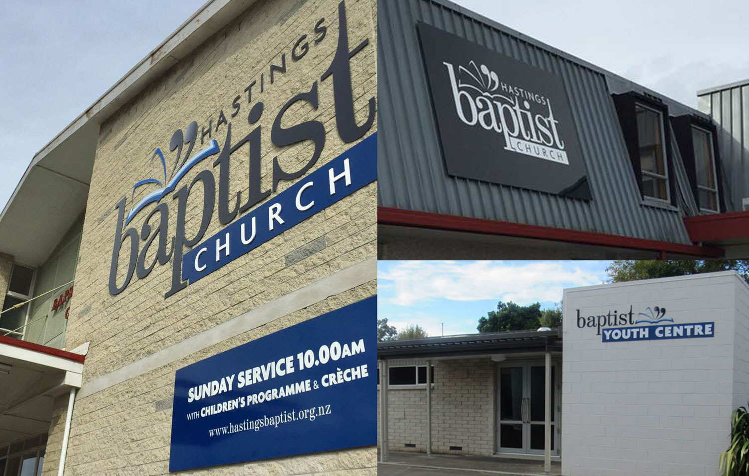
The design of a logo is the hard part of a branding project, so once that was done, its rollout into various print collateral pieces flows out pretty organically.
The brand ‘flavour’ of Hastings Baptist Church material needed to be ‘clear and simple’. So although I could make dramatic cover images for individual items, consistent branding elements—such as logos and titles—were placed on a large area of untextured white background. Interior pages of their booklets have large amounts of white space, and breathable line spacing.