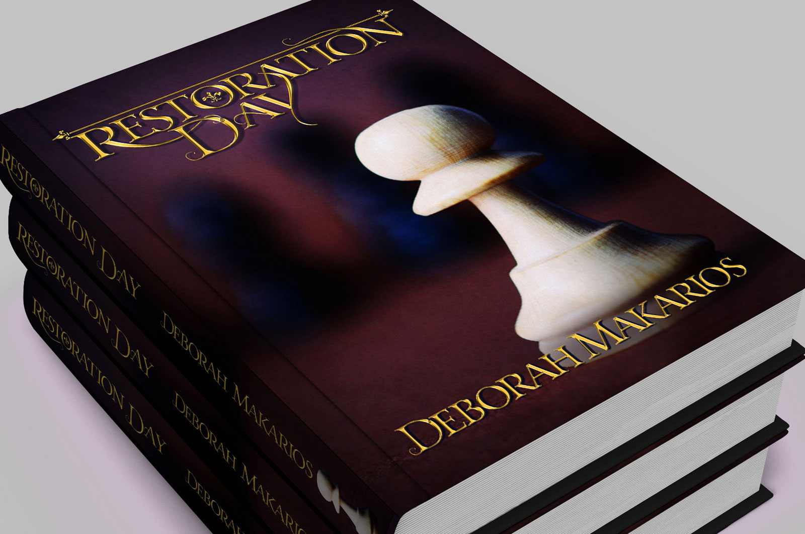
My novelist client wanted title typography that she could place over a pre-selected cover image, and she wanted it of the ornamental style that readers of fantasy associate with novels of that genre; golden and eye-catching, but not so embellished that it became hard to read.
My design used curling vine-like elements to link the title words together—enabling an ornamental look without having large distracting swooshy embellishments, which would have made it harder to read.
These vine-like elements, along with the fleur-di-lys inside the ‘O’, also support the botanical elements of the book’s theme.