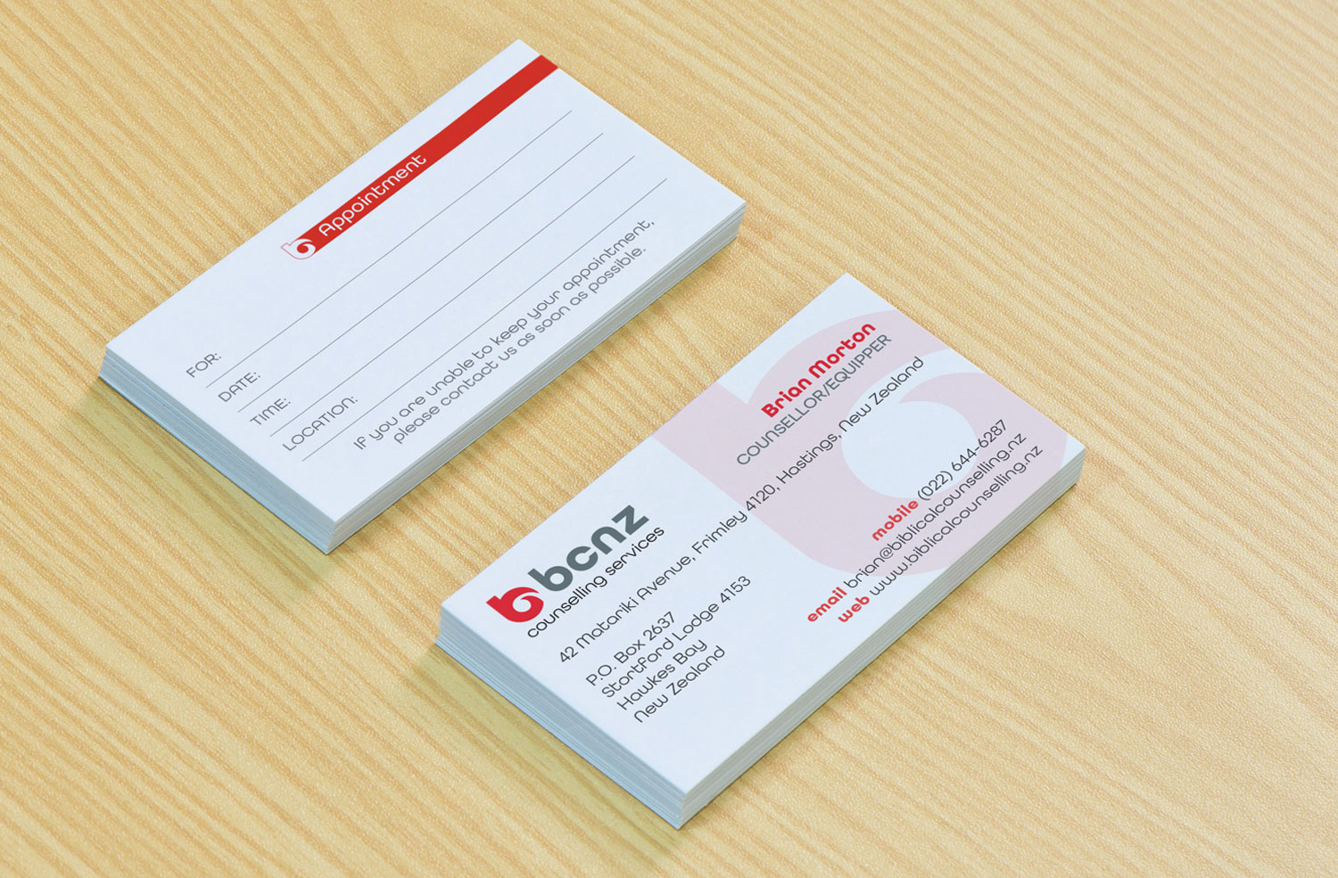
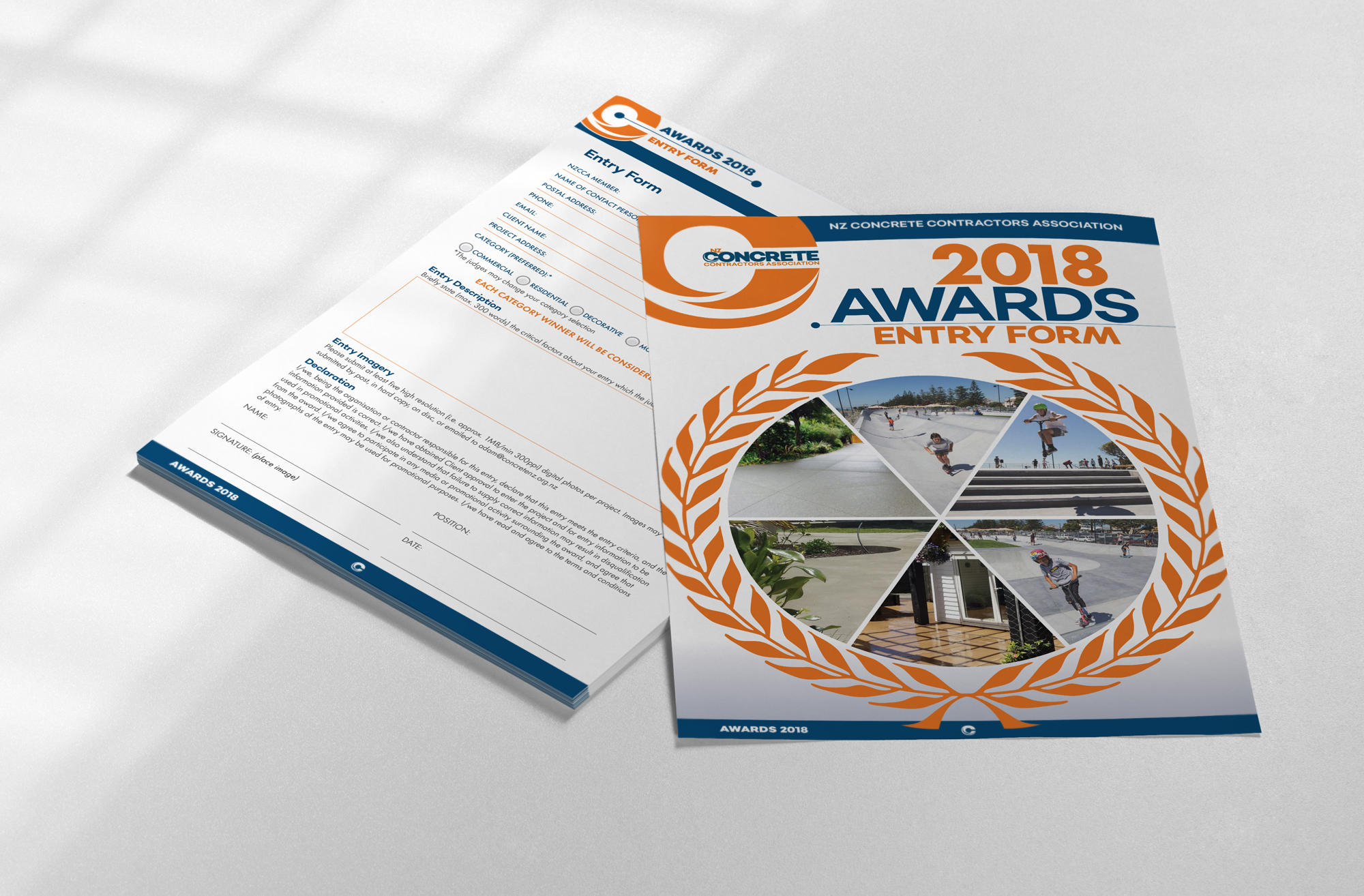
This client already had a logo, but required supplementing material that used it. This included a business card, information brochures, and an interactive PDF form.
The client wanted to convey impressions of ‘care and gentleness’ in the design’s representation of his business, so I visually supported this idea in his card by keeping harsh lines and blocks of bright colour off the front face, instead replicating the soft curves of his logo in a light opacity. Appointment reminders, however, need to be attention-grabbing, so a strong colour block was used on the reverse for this purpose.
(Full card details posted with permission.)