Book Covers: The Whys behind the Whats (Reasons for Design Decisions)

I design ways of communicating a message visually, for tangible outputs. That’s my job, summarily.
It so happens that, while a contractor, I’ve usually done this with logos. Branding a company (or re-branding it) brings its own kind of satisfaction. The company’s not mine, but like its owners and operators, I add my own investment of effort. And I see that investment every time I drive past a building with the logo mounted in gleaming perspex and acrylic.
But even ice cream loses its appeal when that’s all you’re eating, and I missed other things. I missed editorial work — designing for publications, like in magazine layouts, book covers, typesetting, and page layout.
But now, editorial opportunities are coming back. Breath by small oxygenated breath. Toward the end of last year I was pleased to work on two book cover projects, and now I’m in negotiations with a couple of new clients, about doing editorial work for them.
Restoration Day

The first of these book projects was the title art for author Deborah Makarios, and her Young Adult’s fantasy novel Restoration Day.
Deborah required…
…a typographic design indicative of the novel’s content — an ornamental style that readers experienced with the genre already associate with that type of novel. She wanted it golden and eye-catching, but not so embellished that it became hard to read. Deborah had already selected her cover image of the chess pawn. The title art was to be overlaid on this, as the main ornamentation.
So I provided…
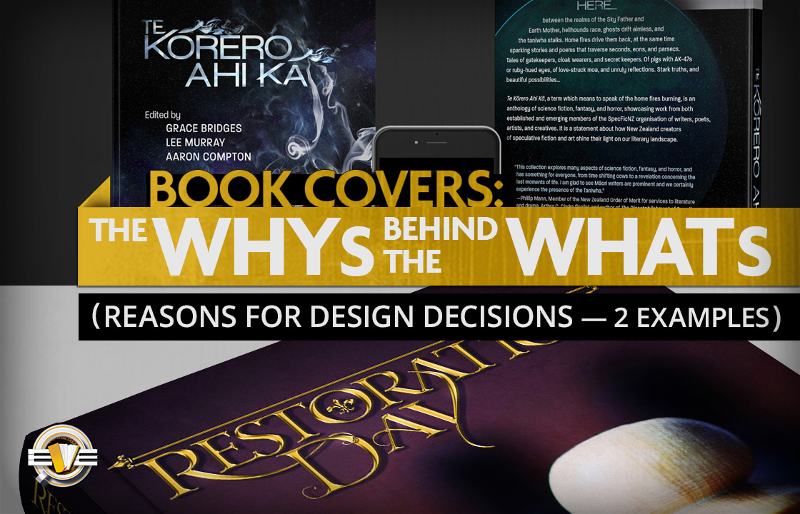
…title art that, while textured like solid gold, had a form similar to vines, with interlocking pieces anchoring the two words together. (This enabled it to look ornamental, without having distracting swooshy embellishments that would have made it hard to read.) Deborah had helpfully provided examples of styles similar to what she was after, so I already knew in which direction to go. The vine-like appearance supports the botanical elements of the book’s themes — which I had been notified of in the briefing process — and the fleur-di-lys inside the ‘O’ paid futher homage to these themes.
Te Kōrero Ahi Kā

Next was the release of Te Kōrero Ahi Kā, an anthology by SpecFicNZ members — an association of speculative fiction writers, in New Zealand. (Speculative fiction is a genre that encompasses all work featuring elements outside of reality as we know it. e.g. science fiction, fantasy, or the supernatural/paranormal.)
SpecFicNZ required…
…a cover that represented the creativity of the book’s contributors. They had no thematic visual requirements, sharing only that the the title (’Te Kōrero Ahi Kā’ means ‘to speak of the home fires burning’) is a statement about how the creators of speculative fiction shine their own light on NZ’s literary landscape.
So I provided…
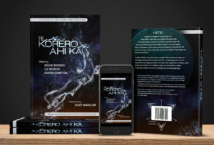
…a design that metaphorically illustrated this collective creation process. To simply make a design of a fire on the cover would, I felt, be too gauche. I wanted to get at the crux of the idea — which is not the metaphorical fire itself, but of what what comes of it.
And what does fire generate? Smoke.
This is why a smoke formation is the central element of the illustration. (The smoky New Zealand graphic is also used as a small text separator, in interior pages.) An orange glow is still there, at the bottom, from the fires kept appropriately out-of-frame, but it’s the swirling and changeable smoke that’s featured, representing the various narrative formations that come of NZ’s authorial creativity.
I have no more book cover jobs in my schedule as I write this, but…the year is young, time will tell…and all those similar sayings.


07 Mar 2018
I like that smoky New Zealand! Subtle, without being easily overlooked.
15 Mar 2018
Thank you, Deborah! Of course, one hopes you like the other one, too — your approval of it being more important than most. 🙂